Reverse Aging Centre
It’s About Time


It’s About Time
In the posh city of Beverly Hills, the new Reverse Aging Centre was looking to become the world’s premier anti-aging clinic. As one might imagine, the brand’s location and big-promise name meant high expectations — which is where we came in. We developed a strategy for a brand that would meet the discerning standards of the clinic’s exclusive clientele.
Reverse Aging Centre’s high-end Beverly Hills location and world-renowned physicians informed the brand’s design and messaging. The clinic also had a rather large service menu (such is the price of comprehensive health, we suppose), making content organization a key element.
We designed and implemented strategies to attract and retain patients. The ultimate goal: a proven model that would drive the clinic’s expansion to new cities.
To support the clinic’s January 2015 launch, we delivered a 70-page strategy document detailing the various means by which Reverse Aging Centre would achieve its business objectives.
This included an overview of the target market, the clinic’s positioning relative to competitors, the brand’s unique value propositions (UVPs), cross-selling and up-selling strategies, and more.
Building upon this research, the deliverable’s final section outlined 10 Sales Campaigns (both B2B and B2C) for implementation during the brand’s launch phase.
Because the brand’s service offerings changed during the pre-launch phase, we adjusted our strategy for the initial brand assets. In its early stages, the company had decided to expand from an exclusive focus on regenerative medicine to a broader offering of anti-aging services. And so the final brand name was chosen to reflect the clinic’s new, more comprehensive approach to medicine.
With its new position as an age reversal service, the logo was designed using clock-like elements and subtle reverse typography. The logo transformed the brand name into a symbol, a visual representation of turning back the biological clock. The symbol would remind the audience of the brand’s promise to help them look and feel young again.

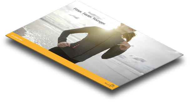
Reverse Aging Centre needed brand collateral that spoke to the quality of its services, but the Beverly Hills marketplace has some fairly high standards. We created a luxe suite of stationery designed to be printed on high quality materials, resulting in a look and touch that would enhance the custom, concierge feel the brand provides its patients.
Keeping in mind that this is a medical facility, not a spa, a delicate line had to be drawn in order to keep a professional and credible tone. We achieved this through simple layouts accented with subtle patterns and secondary brand marks, adopting a professional look while still capturing the vibrant energy of this forward-thinking brand.

With nearly 100 treatments across over a dozen service categories, and more content coming in from doctors on a regular basis, organizing the content was no small task. After a few rounds of revisions, we finalized an architecture for the website that not only organized the existing content, but also left room for our client to add more services in the future.


The web design reflects the chosen color palette and design elements through an optimized layout, while engaging UX/UI touches draw in the user. Because Reverse Aging Centre planned to add videos and new pages throughout its expansion, we made sure our design and development process left room for the new content.
The navigation organizes complex information logically, minimizing the number of steps to the user; but the brand also planned to continue signing on new doctors and expanding services, which meant that the website would be adding yet-unknown content. So we thought ahead with our navigation menus, creating a structure that would be flexible enough to accommodate any new pages the brand might want to add, without compromising user-friendliness.


Every interaction leaves an impression. For a brand that depends on the best possible experience, it’s necessary to plan every detail. Patients should feel that Reverse Aging Centre not only cares for their health, but also cares about them as individuals.
We outlined every pre-sale, sale, and post-sale touchpoint, developing brand standards for every interaction: from the moment a patient walks into a clinic to the time they receive a post-appointment call.

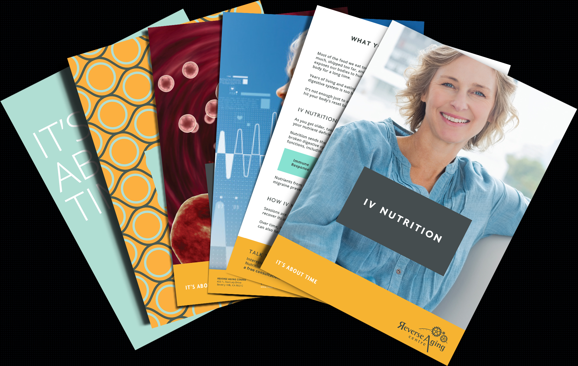
Pamphlets and handouts given out in the office are a highly effective tool for upselling and cross-selling new services. To complement our in-clinic sales strategies, our creative teams developed branded sales support collateral — such as one-pager treatment overviews, service menus, and patient folders.


"Working with Knightsbridge Branding has been a great experience. They took the time to understand our business on a micro level so the branding message could reach as many consumers as possible. They're extremely professional and delivered everything for our brand on time and budget. I would recommend Knightsbridge and will continue using their services."